AddSearch Search UI Library Components
The AddSearch Search UI Library provides visual components to create a functional search interface on your website. Each component includes settings and templates to control its behavior and appearance.
You can customize component layouts and styles using CSS and define how information appears using templates. Templates are particularly useful for displaying custom data fields such as prices or availability within search results.
The Search UI Library works jointly with the Search API Client:
- Search UI Library: Builds the visual parts of the search interface.
- Search API Client: Retrieves the data shown by the UI components and manages configuration such as pagination size or default sorting.
This page outlines the available components, key settings, and provides templating guidance.
Components Overview
- Search Field
- Autocomplete
- Search Results
- Sort By
- Pagination
- Load More Results
- Filters
- Facets
- Active Filters
- Segmented Search Results
- Templating
For detailed technical references, see the AddSearch Search UI Library on npm and the GitHub repository. To track updates and releases, visit the GitHub releases page.
API client details and settings are documented at AddSearch Search API Client on npm and GitHub.
Search Field
Creates an input field for entering search queries.
- Configure placeholder text, a submit button, and enable search-as-you-type to execute queries on each keystroke.
- Search-as-you-type uses fuzzy matching by default for typo tolerance; this can be enabled or disabled in the API client.
- A default Handlebars template is provided and can be customized.
Example and usage: Basic Search UI Example.
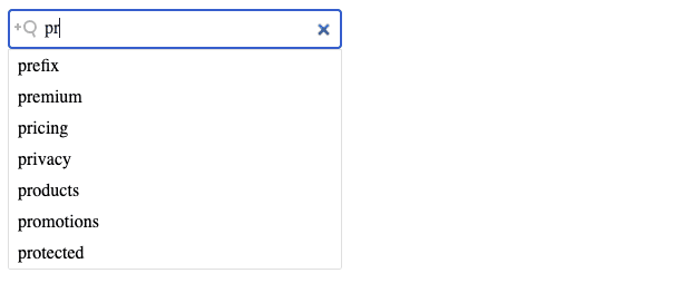
Autocomplete
Displays search suggestions or results as the user types.
- Shows suggestions below the search field for quick selection.
- Helpful for mobile users and guiding users to popular content.
- Requires enabling search suggestions in the AddSearch dashboard.
- Accepts multiple data sources such as autocomplete suggestions, custom filters, or JSON results.
- Number of autocomplete results with custom fields is configurable via the API client.
- Default template can be replaced with a custom one.
Try it live: Autocomplete Suggestions Example.
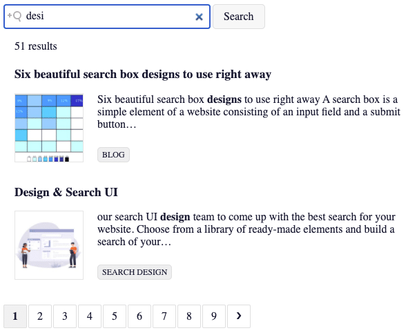
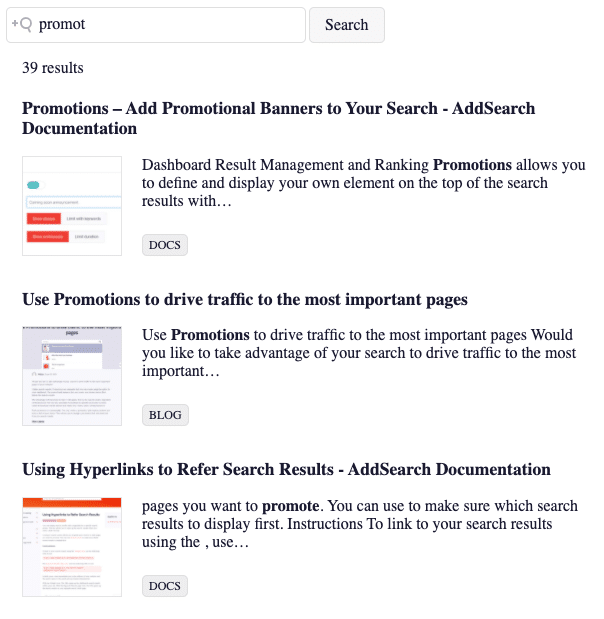
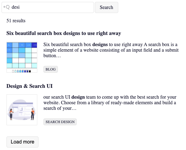
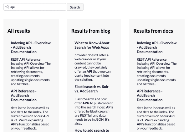
Search Results
Displays a list of search results responding to the query.
- You can customize the layout and displayed data using Handlebars templates.
- Useful for showing custom fields like price or availability.
- Default template shows title, highlight text, category, link, thumbnail.
- CSS styling can create alternative layouts, e.g., grid views.
- Number of results per page is controlled via the API client.
See it live: Basic Results Example.
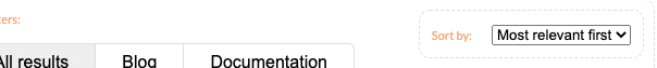
Sort By
Allows users to sort results by various criteria such as relevance, date, or custom data fields.
- Supports two input types: dropdown select lists and radio button groups.
- Sorting by custom fields requires numeric or date data types.
- Default template is customizable.
- Global sorting settings are configured via the API client.
Example: Sort By Component Demo.
Pagination
Divides search results into pages and shows the current page.
- Helps users navigate large result sets by chunking them.
- Template is customizable.
- Number of results per page set through the API client.
Example: Pagination Demo.
Load More Results
Adds a button to load additional result batches below the current list.
- Alternative to pagination, useful for mobile where vertical scrolling is preferred.
- Template supports customization.
- Results per batch controlled via the API client.
Example: Load More Demo.
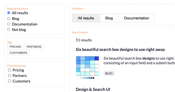
Filters
Displays predefined filtering options for refining search results.
- Supports multiple selection input types like checkbox groups, tags, radio buttons, tabs, and select lists.
- Useful in content-rich sites or e-commerce to narrow results by category, brand, price, etc.
- Filtering options are defined by objects having keys (unique identifiers), labels, and filter criteria (URL patterns/custom fields).
clearOtherFiltersoption clears other filters when one changes (supported with radio, select, tabs).- Template can be replaced.
Example of filters: Filters demo.
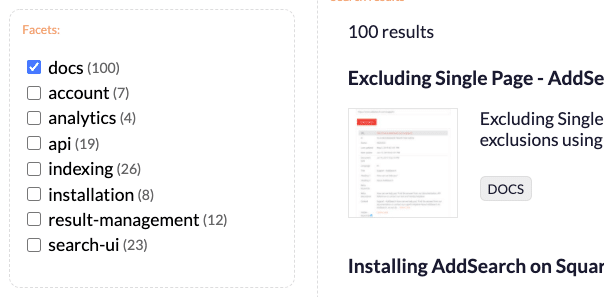
Facets
Facets represent product or content attributes such as color, size, or model.
- The facets component shows dynamic filters populated automatically based on search results.
- Typically displayed as a checkbox group allowing selection of multiple facet values.
- When selecting facets, filter options update to show relevant counts or remove non-applicable choices.
- Useful for e-commerce or content-heavy sites to find subset results efficiently.
- Requires adding facets in the client instance to fetch custom field facet data.
fieldsetting specifies which facets to display;stickyshows counts next to facets.- Template can be customized.
Example: Facets demo.
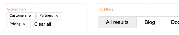
Active Filters
Shows which filters the user has activated and allows clearing them individually or all at once.
- Helps users track and manage applied filters.
- Updates dynamically as filtering changes.
- Template can be customized.
Example: Active Filters demo.
Segmented Search Results
Displays multiple categories of search results in separate segments for a single query.
- Segments can be arranged horizontally or vertically.
- Each segment shows results from a distinct site area like product pages, reviews, or blog posts.
- Requires separate client instances with filters for each segment.
- You can configure default sorting, paging, and create layouts with CSS frameworks or Flexbox.
- Uses templates similar to searchResults.
Example: Segmented search demo.
Templating
Templates define the structure and content of UI components using HTML combined with HandlebarsJS syntax.
- Allows dynamic insertion of search result fields, conditional logic, loops, and helper functions.
- When using crawler-based indexes, field data is generated automatically; with API indexing, you control which fields are indexed and displayed.
- Default templates for all components are available and can be modified.
Customizing Templates
- Assign your template to a variable.
- Pass it as a setting when initializing the component.
Example: Removing Result Count
By removing the placeholder {{ numberOfResultsTemplate }} from the results template, you disable the result count display.
Example: Adding Target URL
Add the {{url}} field in the template to display the URL below the highlight text.
Example: Handlebars Helper
Create JavaScript functions to process data, register them with searchUI.registerHandlebarsHelper(), and use helpers in templates.
Example: Remove a suffix from titles
function cleanTitles(title) {
  return title.replace('- AddSearch Documentation', '');
}

searchUI.registerHandlebarsHelper('titleCleaner', cleanTitles);
Use in template as:
See the Handlebars documentation for more on templating.